Campaign & Content
Design
Role/Tools/Focus line:
Role: Visual Communications Designer | Tools: Photoshop, Illustrator, Nucleus CMS, YouTube Studio | Focus: Email Design · Social Campaigns · Content Creation · Video Management

Bear Creek YouTube Page

Bear Creek Facebook Banner
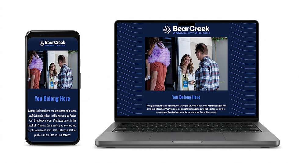
Bear Creek Church Newsletter
Bear Creek YouTube Page
Overview
Every week, Bear Creek Community Church communicates with a community of 5,000+ email subscribers and 1,100 weekly attendees across email, YouTube, and web. I design and produce all of it, on deadline, across every format, every single week.
Email Newsletters — Weekly, Monthly & Events
Design and manage all email newsletters from concept to send. Each issue involves writing and editing copy, designing the full layout, selecting photography from the photographer's deliverables, retouching images in Photoshop for sizing and polish, and making sure every newsletter reflects current brand guidelines. Event newsletters are designed separately for special occasions, seasonal campaigns, and sermon series — each one tailored to its specific audience and purpose.
Social & Platform Banners
Designed the Facebook and YouTube channel banners for the brand relaunch, extending the new visual identity consistently across both platforms. Each banner was built to work at platform-specific dimensions while maintaining the same brand feel across every surface.
YouTube Channel Management
Manage the full Bear Creek YouTube channel end-to-end. After each live service, I edit the recorded stream for post-production upload, design the video thumbnail, and write all copy, including titles, descriptions, and calls to action. Every thumbnail is designed as part of a cohesive visual series, so the channel looks intentional and on-brand at a glance.
Photo Selection & Retouching
Review and select photography from the photographer's deliverables to match the content and copy for each campaign. Images are retouched in Photoshop as needed, resized for each format, and cleaned up to remove distractions before anything goes live. Every photo that goes out represents the brand, so nothing leaves without being publication-ready.
Reflection
Managing ongoing creative for a real audience with real deadlines taught me something no school project can: consistency is a skill. Showing up every week with work that is on-brand, on-time, and genuinely good requires organization, creative discipline, and the ability to move fast without cutting corners. This is the work that built my production instincts and proved I can handle the full pace of agency creative.